Evolution of the Lindner Brand
We are constantly striving to evolve our brand and business practices to deliver the best possible products and experience for our customers.

One of our latest projects was refreshing the Lindner brand image. At the outset, we didn’t anticipate that it would be such a huge task, but we’re so pleased we powered on through some tough decisions to come to this final result.
Here are a few insights as to how and why it came about.
A Little Background
We identified the need to review our brand way back in 2017 when we were revising our business plan. We realised that despite the importance we place on our heritage, the way the business had been naturally evolving, and future we envisaged, was taking us in a new direction and our branding needed to reflect that.
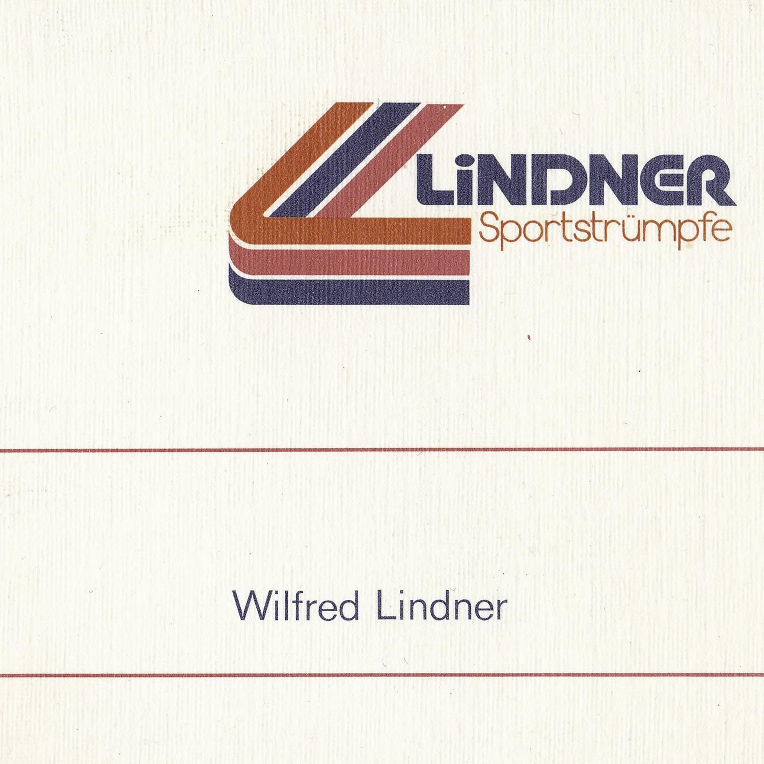
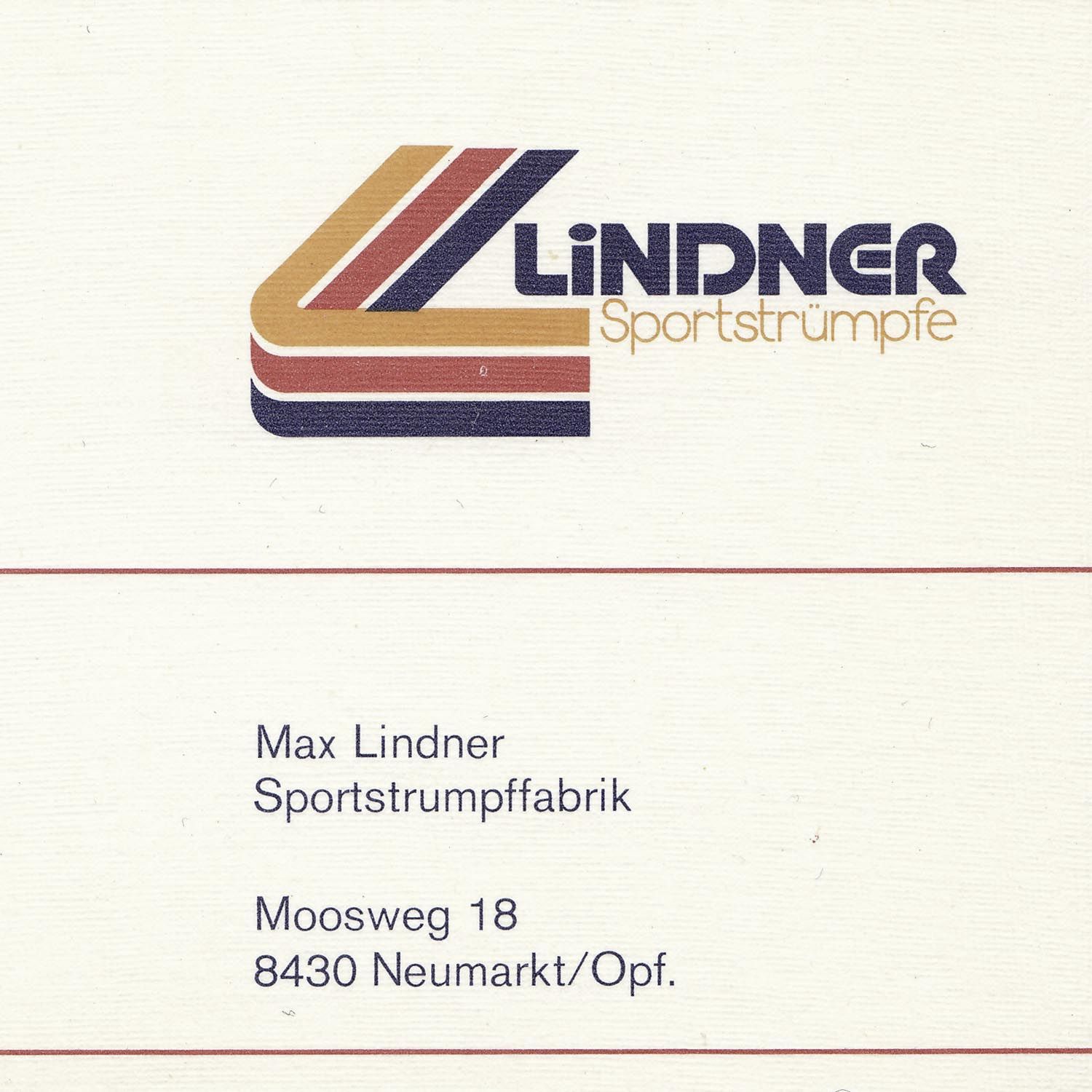
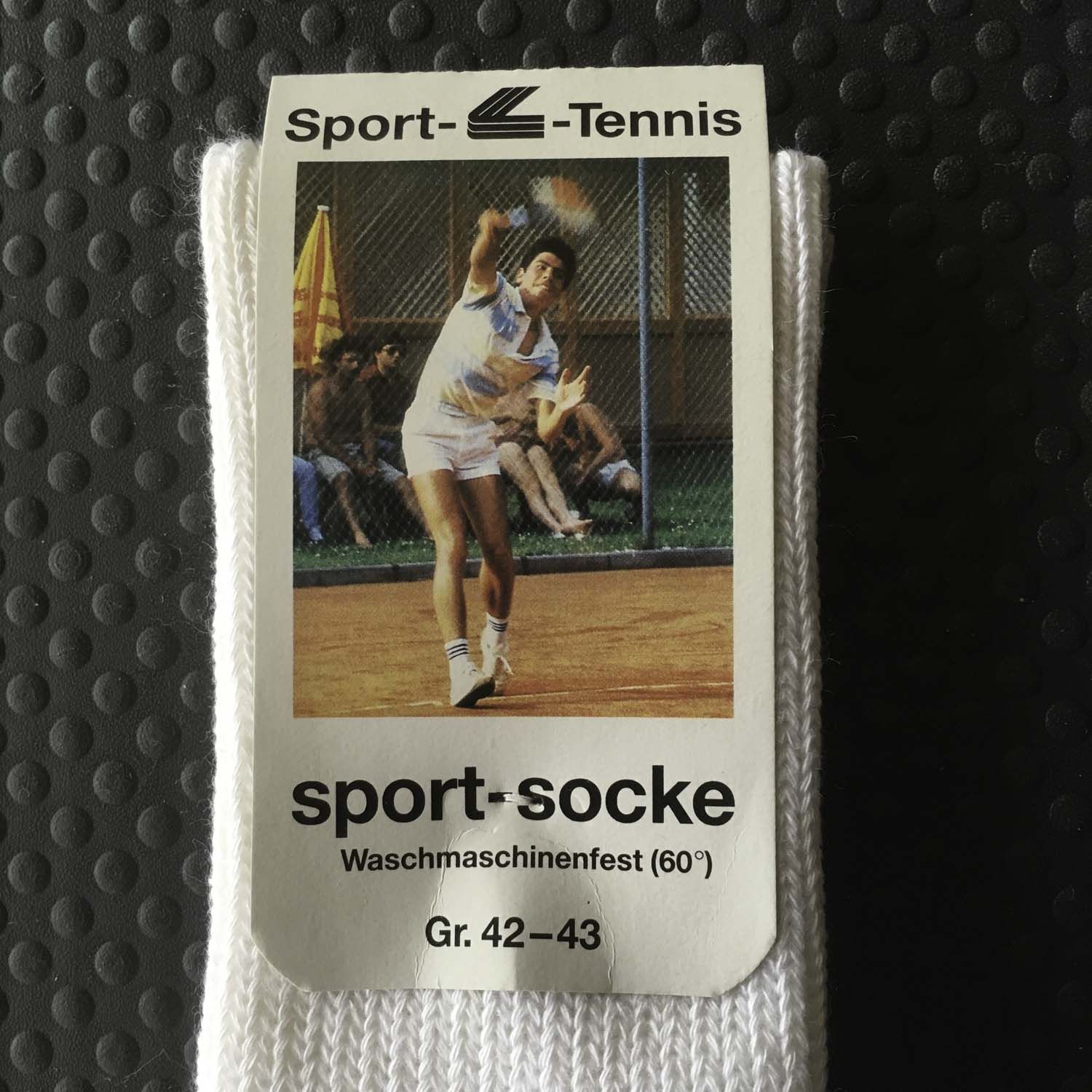
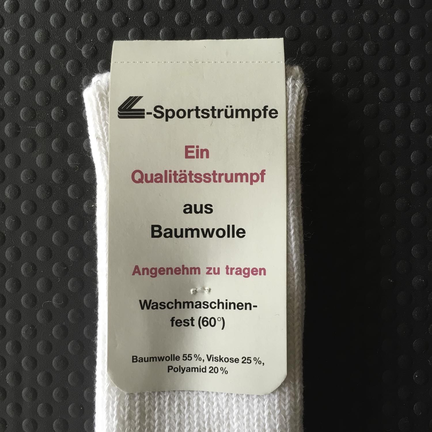
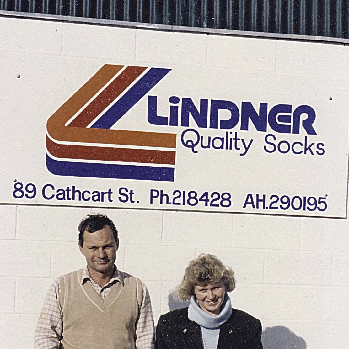
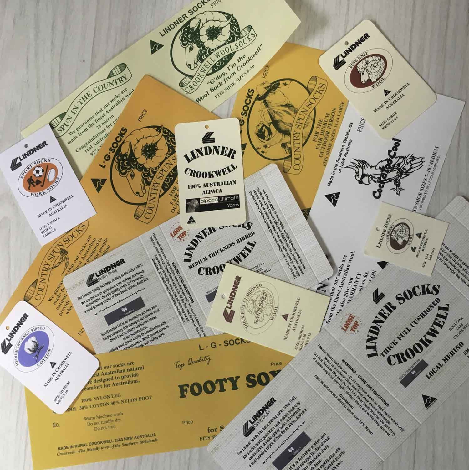
Our original 3L logo had seen the Lindner Family through three factories and three generations on two continents. It served us well, and it has a definite retro charm about it, but it no longer complemented our products and it did not meld with the course we have charted for the future.
It was becoming difficult to represent our brand using our old logo and colour scheme, particularly on digital platforms. When it was initially devised in Germany in the '70s, Lindner Socks were focused on primarily on sportswear, and the colours, shape and font communicated that. By 2019 we were focused on natural fibres, heritage and craftsmanship, and environment and sustainability. We needed a logo and packaging that would represent our company values going forward.
Additionally, our product range had expanded over the years. We needed some structure behind our different lines of products, tied together by a cohesive look.
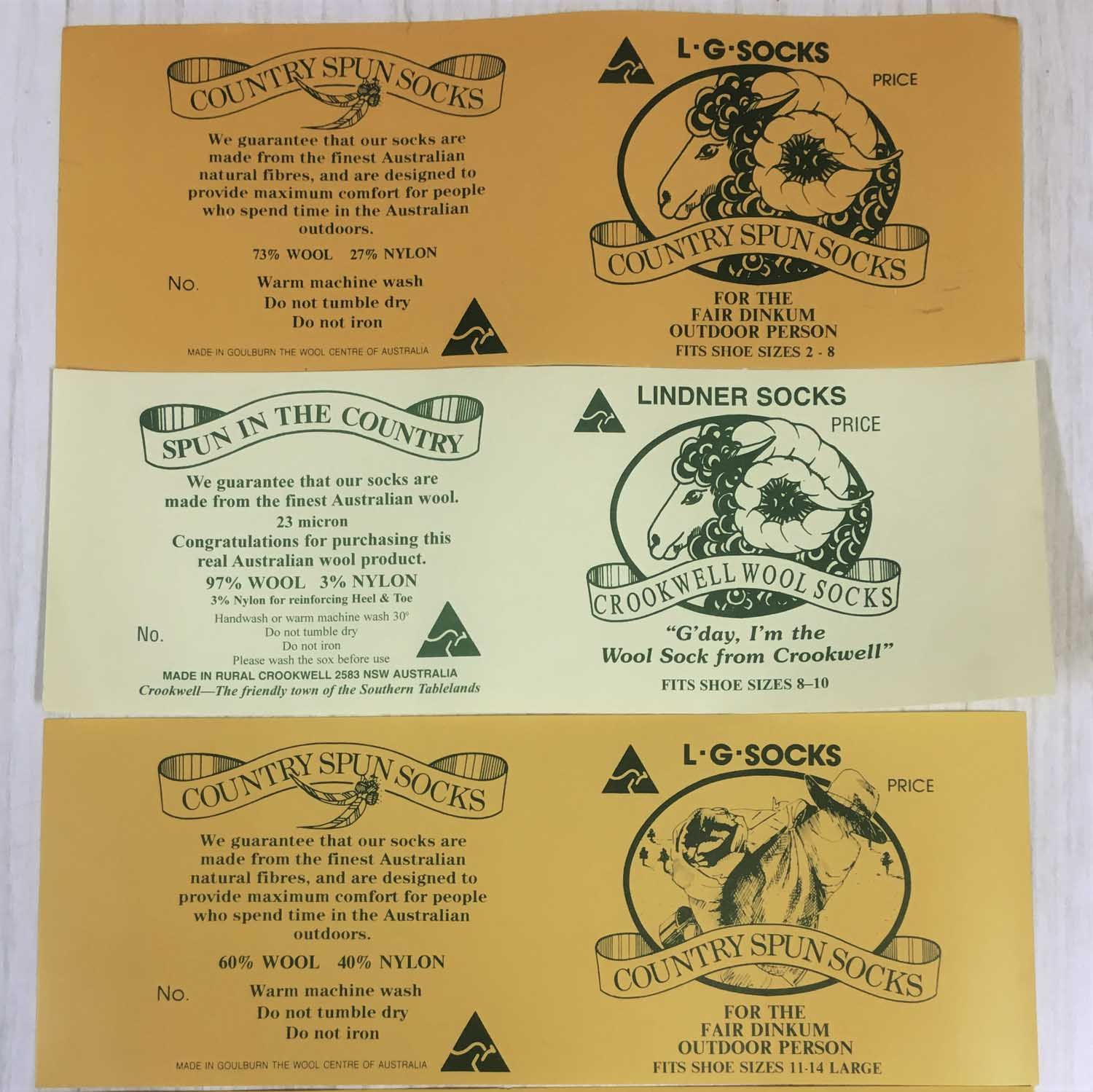
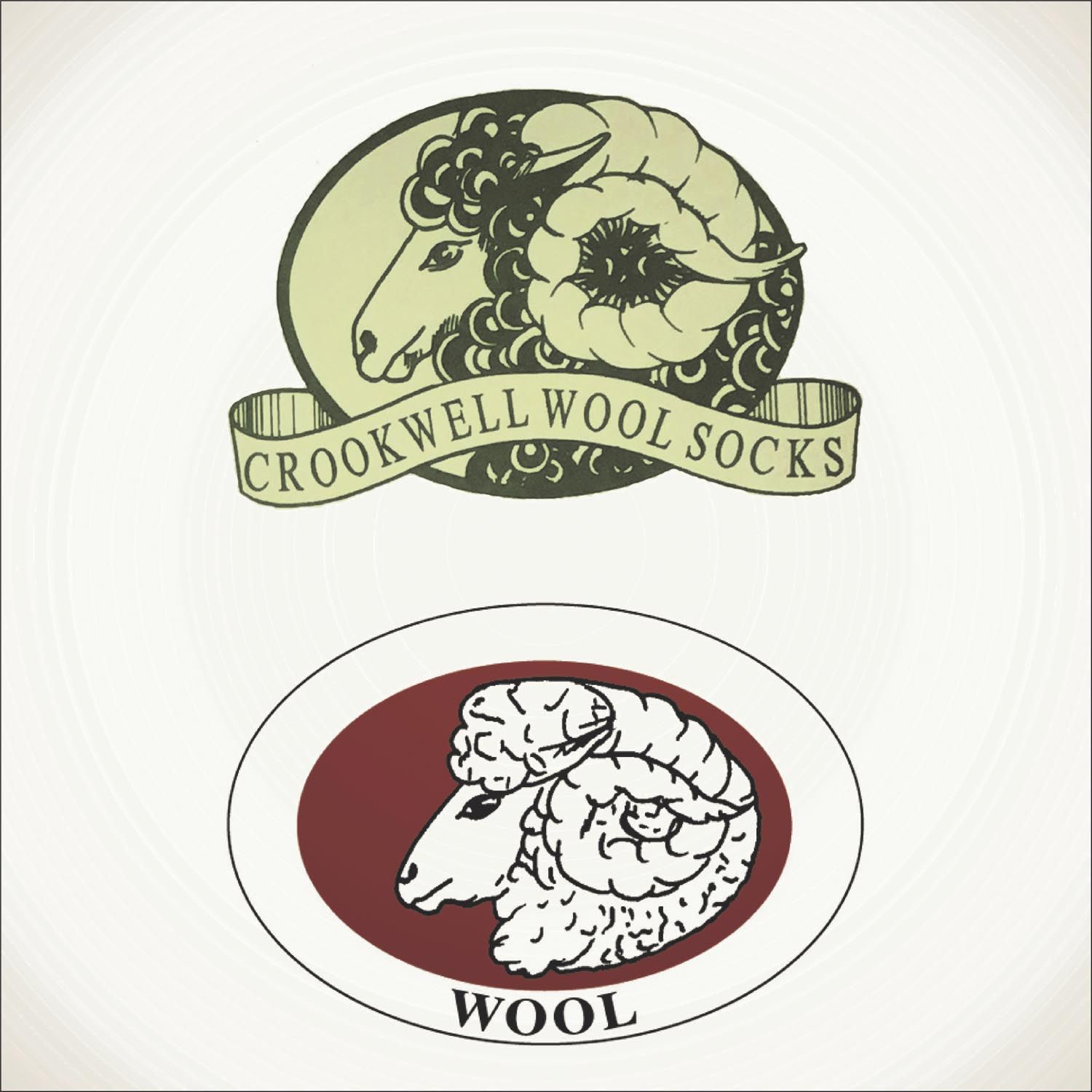
Originally when preparing our first design brief, we did not want to have too much of a departure from the original 3L logo. We were aiming for an evolution to tie the past, present and future; to show our journey and to honour our heritage. The gallery at the bottom of the page shows the evolution of logo and packaging from 1970s to today.
Through several design iterations (and a few identity crises) we made a bold call to take the logo design a leap forward rather than a shuffle. In doing so, it was as though everything else became clearer. Suddenly, we had a distinct view of our identity and all the other branding elements began to fall into place: the colours, the product names, the packaging all followed relatively smoothly.
Variations on the new Lindner Socks logo
What Was New?
Logo
We’ll begin by introducing you to the new logo. We engaged Jon, the talented graphic designer of Jon Shirley Creative in Canberra, to explore new and innovative ways of presenting, categorising and promoting the Lindner brand and product range.
Jon delivered. We’re so happy with the results
Jon managed to re-interpret our previous logo by maintaining the lines and the suggestion of an ‘L’ in the lettermark, while also subtly representing a pair of intertwined socks.
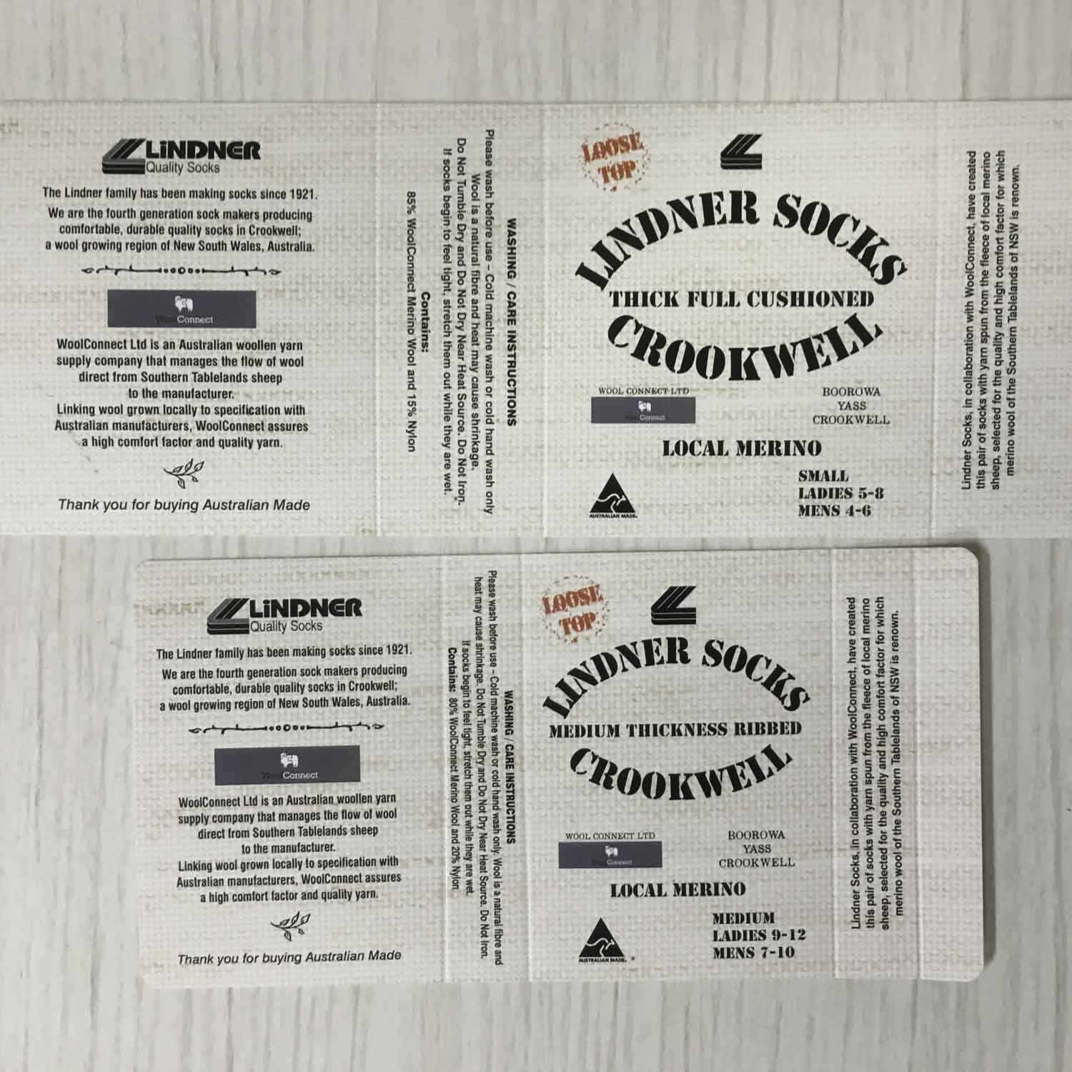
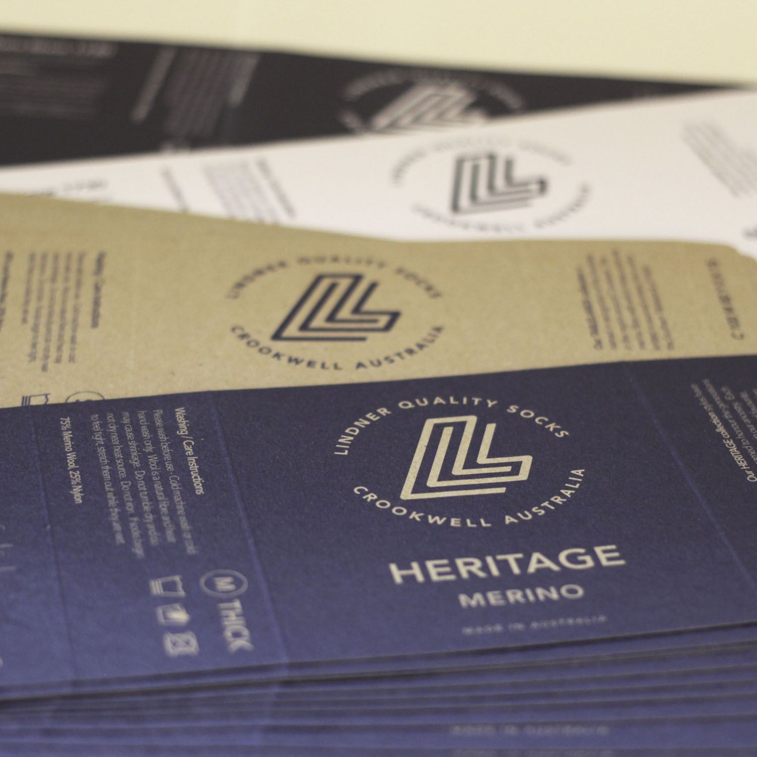
![]() The new logo carried forward some of the design elements of our old logo; the slant of the vertical lines in the lettermark, the combination of rounded and square corners, and the uppercase Lindner typeface. However, the weight of these elements was reduced for a lighter, fresh and modern interpretation.
The new logo carried forward some of the design elements of our old logo; the slant of the vertical lines in the lettermark, the combination of rounded and square corners, and the uppercase Lindner typeface. However, the weight of these elements was reduced for a lighter, fresh and modern interpretation.
By simplifying our brand to a denim and white palette, we have carried forward one of the colours of our old brand colour scheme, removing the distraction of the old trio of navy, maroon and orange, to achieve more harmonious and timeless look. The classic combination of denim and white has been around for a long time, and carries a link to past heritage while still being current now and into the future.
Our name remains. Over the last thirty years in Australia our customers have grown to know and trust Lindner Quality Socks, and we plan to be around for a long time yet. We put our family name to our brand because we wear our name with pride in what we do both personally and professionally.
Product Names and Collections
All of the products offered by Lindner Quality Socks fall under three collections: Heritage, Tablelands, and Luxury.
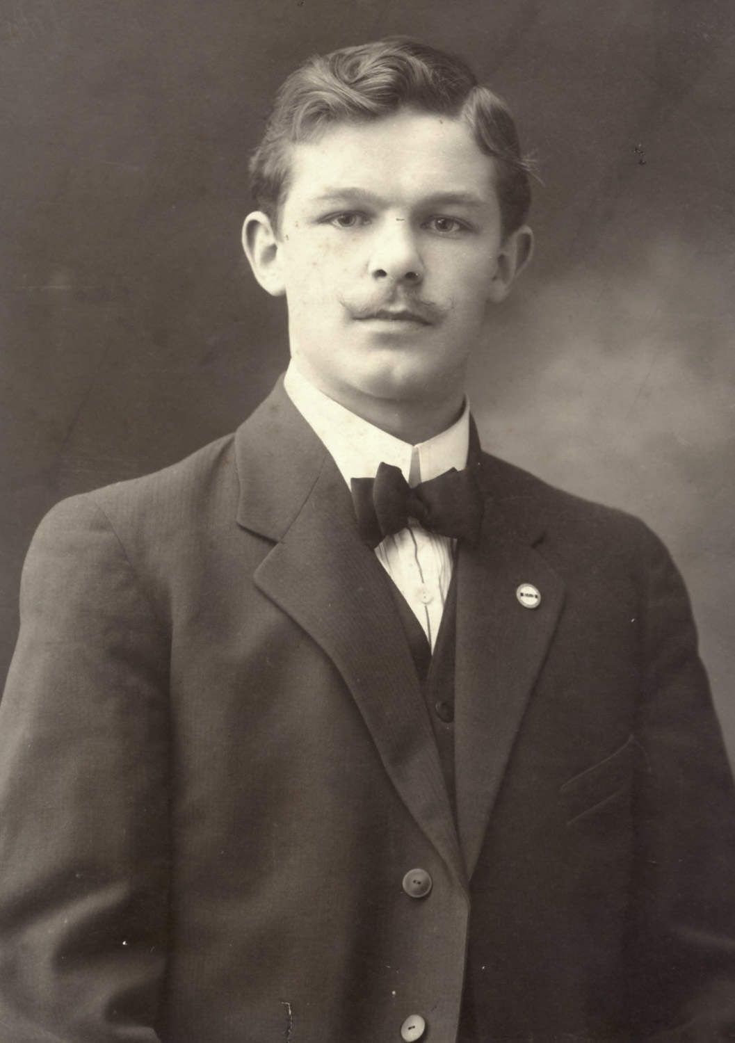
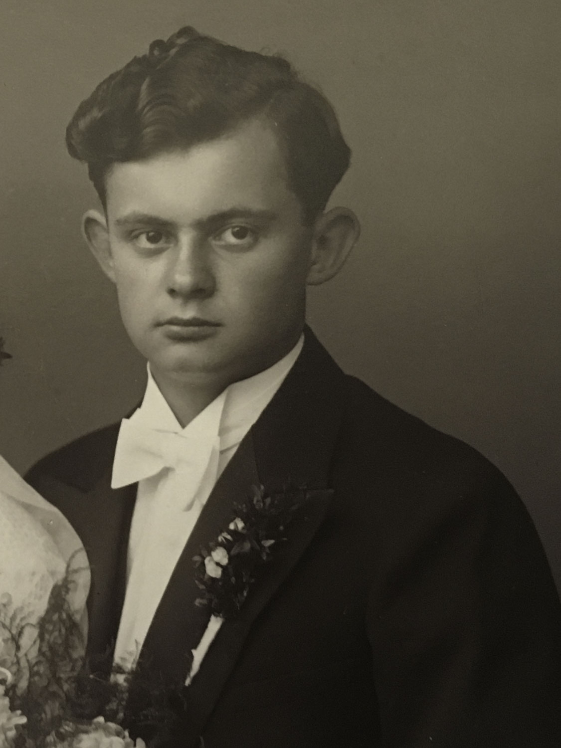
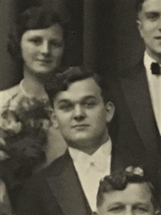
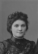
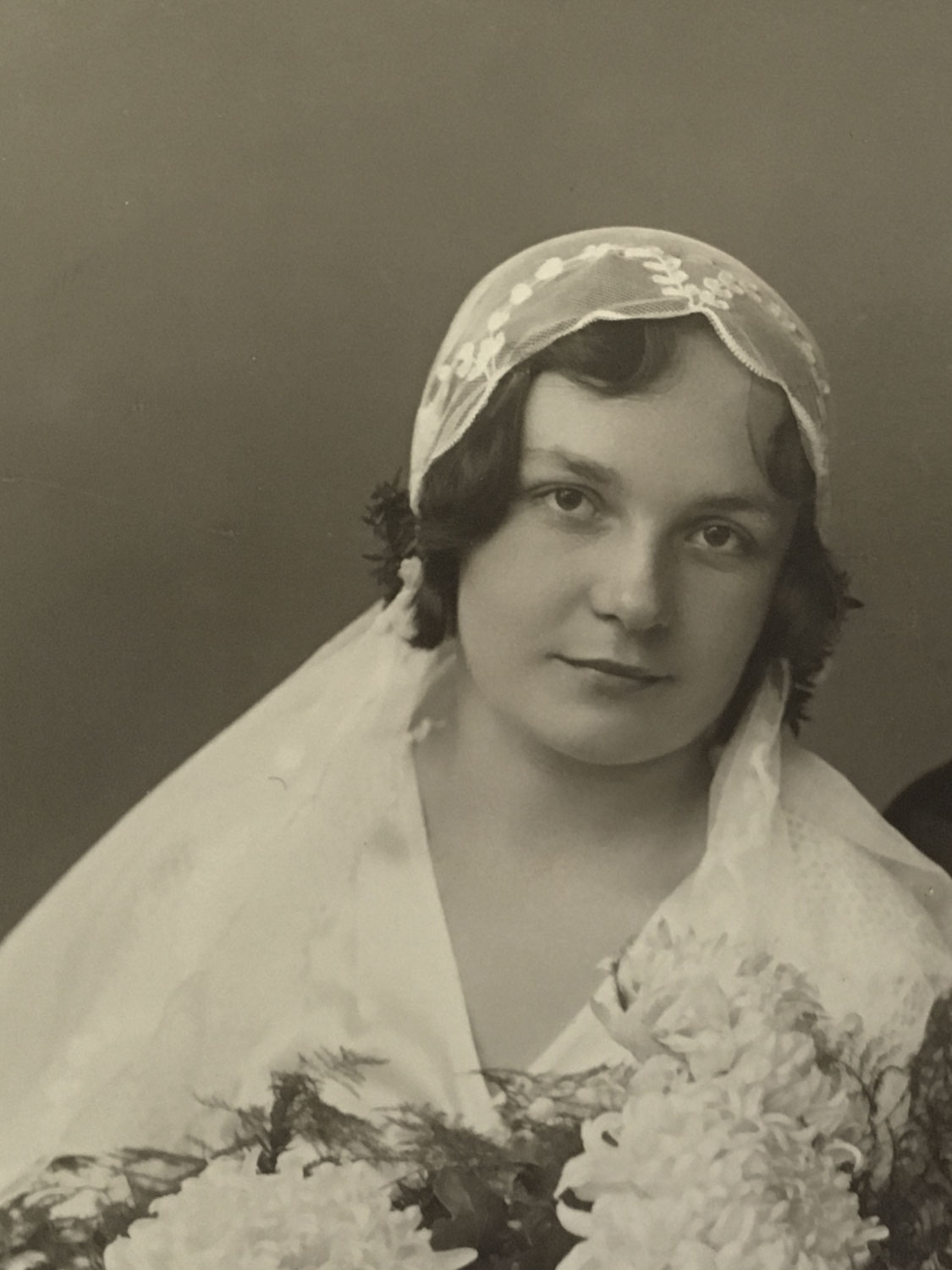
The Heritage Collection brings together the many styles we’ve been making since we first started knitting socks in Australia in 1988. It’s a testament to the design and quality of these socks that they’re still sought after and loved by customers after all these years. Knitted from merino wool or cotton, or a blend of the two, the individual styles in the Heritage Collection are named after our forebears, each of whom is a part of our long lineage of sock-makers. We are proud to honour those who came before us. You'll find a gallery of portrait images of Heritage Collection namesakes below.
The Tablelands Collection are the socks knitted from the wonderful fine merino wool grown by our local farmers in the Southern Tablelands of NSW. This area is renowned for its long history in wool production, and the knowledge and expertise of our local farmers ensures that the yarn from which these socks, scarves, beanies and jumpers are knitted consistently meets the fine micron and fibre strength requirements to deliver soft yet durable end products. Each item in the Tablelands Collection borrows its name from a town or locality within the Southern Tablelands to give a nod to the growers, and the people and places that make this place home to Lindner Socks.
Our Luxury Collection encompasses our newest additions to the product range. These are beautiful socks made from fine local merino wool, and alpaca yarn blended with silk, as well as the softest and warmest scarves knitted from 100% alpaca fibre. These products are named after some of the towns in our local region.
Portraits - The faces behind the names we've chosen for our products


Packaging
Our new packaging brought together all of the aspects of our new branding. The colours, the logo, the collections and product names, and the story, all wrapped around the products we are proud to make and present to you.
When faced with the task of designing a new range of packaging, we were excited to take the opportunity to put our ethos into action by making it as sustainable as possible.
Our choices for paper stock and printers was strongly driven by our desire to minimise our impact on the environment. We will do all we can to reduce our use of plastics, and to ensure that materials we consume are ethically and sustainably produced.
Revolution Print in Goulburn has been a dream to work with. They have been very understanding of our priority focus on sustainability, and have also patiently helped us overcome a few hurdles as we’ve insisted on getting things just so. It helps that they’re local!
We have selected all post-consumer recycled materials for our card stock, in both Ecostar White Uncoated and Botany Kraft card stock. We spent a lot of time researching print methods and made a conscious choice to not use any foil stamping, spot UV or any other plastic coatings, so that our packaging remains fully recyclable and we don’t utilise any harmful chemicals.
By choosing to make all of our labelling a wrap style, we have said goodbye to our old swing tags and eliminated the need for plastic attachers. We are also transitioned our postage satchels to completely compostable alternatives, and we regularly recycle any soft plastics that happen to come our way (we avoid as much as possible). Step by step we aim to minimise our contribution to waste, and to take positive action to improve our environment.
Thank you!
We’re grateful to the many friends, family, and professionals who were a part of pulling our new branding together. Thank you all for your ideas, feedback, and patience as we navigated this process.
We hope that you, our customers and friends, are as happy with our new brand image as we are, and as always, we thank you for your loyal support.